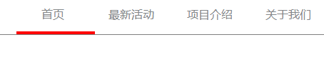
我们有时做项目需要使用到类似上面的效果,可以参考下面的代码实现方法
html页面代码:
   <div class="header">
        <ul>
          <li><a href="#">首页</a></li>
          <li><a href="#">最新活动</a></li>
          <li><a href="#">项目介绍</a></li>
          <li><a href="#">关于我们</a></li>
          <span class="move"> </span>
        </ul>
    </div>
css代码实现:
 <style>
* {
  padding: 0px;
  margin: 0px;
}
body{
  min-width: 1280px;
}
.header {
  height: 56px;
  width: 100%;
  border: 1px solid gray;
}
div.logo {
  float: left;
  margin: 10px 50px;
}

div.logo span {
  font-size: 23px;
  display: block;
  float: right;
}
ul {
  list-style-type: none;
  padding: 0px;
  float: right;
  position: relative;/*子元素absol*/
}
ul img{
  position: relative;
  top: 3px;
}
ul li {
  width: 110px;
  height: 56px;
  text-align: center;
  float: left;
}
ul li a {
  color: #848789;
  text-decoration: none;
  line-height: 56px;
}
ul a:hover{
  color: red;
}
.move{
  height: 4px;
  width: 110px;
  border-top: 4px solid red;/*只需要将上边显示出来*/
  position: absolute;
  left: 0;
  top: 52px;
  transition: left .2s ease-in-out 0s;/*包含四个过度属性:执行变换属性、执行时间、速率、延迟*/
  -webkit-transition: left .2s ease-in-out 0s;/*chrome和safari*/
  -moz-transition: left .2s ease-in-out 0s;/*firefox*/
  -o-transition: left .2s ease-in-out 0s;/*opera*/
}
li:nth-child(1):hover~ .move{  /*li元素的父元素的第一个子元素,当鼠标停留其上时,move元素的left属性改变*/
  left: 0px;
}
li:nth-child(2):hover~ .move{
  left: 110px;
}
li:nth-child(3):hover~ .move{
  left: 220px;
}
li:nth-child(4):hover~ .move{
  left: 330px;
}
li:nth-child(5):hover~ .move{
  left: 440px;
}
li:nth-child(6):hover~ .move{
  left: 550px;
}
</style>
使用上面的代码就可以实现出上图所示效果,供大家参考。


 关于简忆
关于简忆 简忆诞生的故事


 粤ICP备16092285号
文章评论(0)